September 15, 2020
Another Look at Revising the Pareto Chart
—The Python code behind the Revising the Pareto Chart
This Juypter notebook reproduces the experiment in Revising the Pareto Chart. It includes the source code for all of the graphs in that article and the Monte Carlo algorithm used.
It’s important to note that what appears here and in Revising the Pareto Chart may not accurately reproduce the experiments described in Wilkinson’s original paper.
What appears in my articles are my attempt to reproduce Wilkinson’s work. Deviations between Wilkinson’s results and my own are noted.
Defect Types
There are 6 defect types. The nature of these defects is irrelevant. It is sufficient that the categories be identified.
defect_types = [ 'Type 1', 'Type 2', 'Type 3', 'Type 4', 'Type 5', 'Type 6', ]
num_defect_types = len(defect_types)
Number of Defects
There are $40$ defects. This is a randomly chosen number.
num_defects = 40
Probability Distribution
The probability distribution for defects assumes a multinomial with equal p-values.
Defect Type P-Values
A critical part of the thesis requires that each defect type occur with equal probability. These p-values enforce this constraint.
equal_p_values = [ 1 / num_defect_types ] * num_defect_types
Multimomial Probability Mass Function
A multinomial distribution is selected because we want each trial to result in a random distribution of the number of observed defects in a trial.
from scipy.stats import *
defect_distribution_per_trial = multinomial(num_defects, equal_p_values)
Monte Carlo Algorithm
The number of trials is key to reproducing the experiment. You get different results for $5000$, $20000$ and $40000$ trials.
An open question regarding the original paper and these experiments is what does “a few thousand trials” mean. I suspect that the original paper used closer to 5,000 trials. These experiments and the results in my artical show that the order statistics change through the $30000$ to $350000$ trials.
num_trials = 5000
Sample Generation
For each sample, randomly assign the defects to each category.
def generate_sample():
    """Obtain a single sample."""
    return defect_distribution_per_trial.rvs()[0]
Two collections of trials are retained. Sorted trials mimics the algorithm in the paper. Trials takes a look at what happens if the results are not sorted according to the Pareto method.
The value of sorted and unsorted trials lies in observing the banding that occurs in the sorted trials. This banding reflects the Pareto distribution and is critical to reproducing the experiement.
import math
import numpy as np
import pandas as pd
trial = list()
sorted_trial = list()
for k in range(num_trials):
    s = generate_sample()
    trial.append(s)
    sorted_trial.append(np.sort(s)[::-1])
The Data Plots
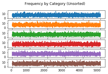
Frequency By Category (Unsorted)
The value of charting the unsorted frequency lies in ensuring that the sorting the trails reproduces the Pareto distribution required by the experiement.
import matplotlib.pyplot as plt
categories = pd.DataFrame(trial, columns = defect_types)
categories.plot(kind = 'line', subplots = True, sharex = True, sharey = True,
    legend = False, title = 'Frequency by Category (Unsorted)', rot = 0)
array([<matplotlib.axes._subplots.AxesSubplot object at 0x11b4721d0>,
       <matplotlib.axes._subplots.AxesSubplot object at 0x11bf13c50>,
       <matplotlib.axes._subplots.AxesSubplot object at 0x11bed4eb8>,
       <matplotlib.axes._subplots.AxesSubplot object at 0x11bf561d0>,
       <matplotlib.axes._subplots.AxesSubplot object at 0x11bf824a8>,
       <matplotlib.axes._subplots.AxesSubplot object at 0x11be6c780>],
      dtype=object)
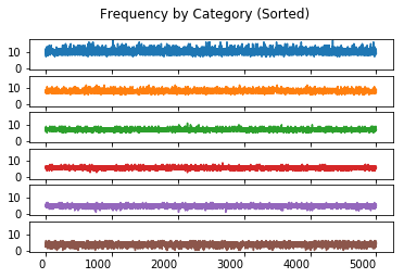
Frequency By Category (Sorted)
The value of charting the sorted frequency is the insight it provides on the effect of sorting the data in each trial.
sorted_categories = pd.DataFrame(sorted_trial, columns = defect_types)
sorted_categories.plot(kind = 'line', subplots = True, sharex = True, sharey = True,
    legend = False, title = 'Frequency by Category (Sorted)', rot = 0)
array([<matplotlib.axes._subplots.AxesSubplot object at 0x11be6c9e8>,
       <matplotlib.axes._subplots.AxesSubplot object at 0x11baec908>,
       <matplotlib.axes._subplots.AxesSubplot object at 0x11b8fa630>,
       <matplotlib.axes._subplots.AxesSubplot object at 0x11b9f47f0>,
       <matplotlib.axes._subplots.AxesSubplot object at 0x11b90c748>,
       <matplotlib.axes._subplots.AxesSubplot object at 0x11b94b4a8>],
      dtype=object)
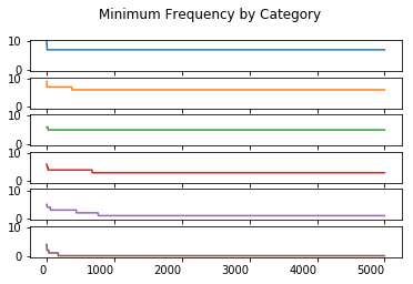
Order Statistics
Wilkinson describes the requirement for order statistics to stablize. The paper doesn’t describe the use of any order statistics, except upper and lower frequency bounds. I explore several different order statitics in this section.
minimum_statistic = pd.DataFrame(columns = defect_types)
maximum_statistic = pd.DataFrame(columns = defect_types)
median_statistic = pd.DataFrame(columns = defect_types)
range_statistic = pd.DataFrame(columns = defect_types)
for i in range(0, num_trials):
    minimum_statistic.loc[i] = sorted_categories.head(i).min()
    maximum_statistic.loc[i] = sorted_categories.head(i).max()
    median_statistic.loc[i] = sorted_categories.head(i).max()
    range_statistic.loc[i] = (sorted_categories.head(i).max() - sorted_categories.head(i).min())
Minimum Order Statistic
minimum_statistic.plot(kind = 'line', subplots = True, sharex = True, sharey = True,
    legend = False, title = 'Minimum Frequency by Category', rot = 0)
array([<matplotlib.axes._subplots.AxesSubplot object at 0x11b8fbc18>,
       <matplotlib.axes._subplots.AxesSubplot object at 0x11b56add8>,
       <matplotlib.axes._subplots.AxesSubplot object at 0x11b8c16a0>,
       <matplotlib.axes._subplots.AxesSubplot object at 0x11b6a9668>,
       <matplotlib.axes._subplots.AxesSubplot object at 0x11b75c630>,
       <matplotlib.axes._subplots.AxesSubplot object at 0x11b8015f8>],
      dtype=object)
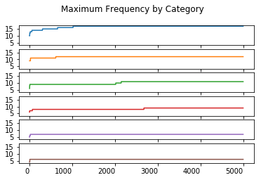
Maximum Order Statistic
maximum_statistic.plot(kind = 'line', subplots = True, sharex = True, sharey = True,
    legend = False, title = 'Maximum Frequency by Category', rot = 0)
array([<matplotlib.axes._subplots.AxesSubplot object at 0x11b7e4cc0>,
       <matplotlib.axes._subplots.AxesSubplot object at 0x11b6ec828>,
       <matplotlib.axes._subplots.AxesSubplot object at 0x116bc9a58>,
       <matplotlib.axes._subplots.AxesSubplot object at 0x116bf1d30>,
       <matplotlib.axes._subplots.AxesSubplot object at 0x11ac9f048>,
       <matplotlib.axes._subplots.AxesSubplot object at 0x11b56f320>],
      dtype=object)
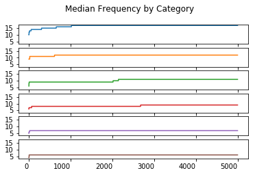
Median Order Statistic
median_statistic.plot(kind = 'line', subplots = True, sharex = True, sharey = True,
    legend = False, title = 'Median Frequency by Category', rot = 0)
array([<matplotlib.axes._subplots.AxesSubplot object at 0x11b8fd5c0>,
       <matplotlib.axes._subplots.AxesSubplot object at 0x11c340278>,
       <matplotlib.axes._subplots.AxesSubplot object at 0x11c365518>,
       <matplotlib.axes._subplots.AxesSubplot object at 0x11c38d7f0>,
       <matplotlib.axes._subplots.AxesSubplot object at 0x11c3b4ac8>,
       <matplotlib.axes._subplots.AxesSubplot object at 0x11c3dcda0>],
      dtype=object)
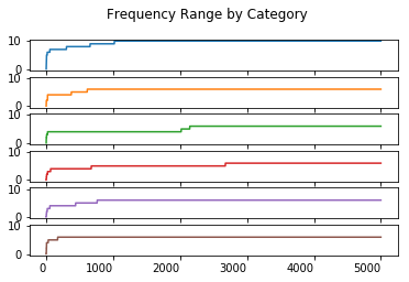
Range Order Statistic
range_statistic.plot(kind = 'line', subplots = True, sharex = True, sharey = True,
    legend = False, title = 'Frequency Range by Category', rot = 0)
array([<matplotlib.axes._subplots.AxesSubplot object at 0x11c5357b8>,
       <matplotlib.axes._subplots.AxesSubplot object at 0x11c57b8d0>,
       <matplotlib.axes._subplots.AxesSubplot object at 0x11c5a1ba8>,
       <matplotlib.axes._subplots.AxesSubplot object at 0x11c5c9e80>,
       <matplotlib.axes._subplots.AxesSubplot object at 0x11c5fb198>,
       <matplotlib.axes._subplots.AxesSubplot object at 0x11c624470>],
      dtype=object)
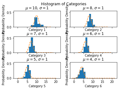
Histogram by Category
The value of charting a histogram by category is that it shows the distribution of the sorted data and permits the exploration of whether this sorting matches a normal distribution.
Determination of whether this is a normal distribution is important to understanding if the calculation of the confidence intervals for a percentile should use the normal distribution’s $Z$ value.
num_bins = num_defect_types
fig, ax = plt.subplots(nrows = 3, ncols = 2, sharex = True, sharey = True)
fig.suptitle('Histogram of Categories')
fig.subplots_adjust(hspace=0.6)
for i in range(0, num_defect_types):
    mu = round(sorted_categories.T.iloc[i].mean())
    std = round(sorted_categories.T.iloc[i].std())
    col = i % 2
    row = i // 2
    n, bins, patches = ax[row, col].hist(sorted_categories.T.iloc[i], num_bins, density=1)
    xmin, xmax = plt.xlim()
    y = np.linspace(xmin, xmax, (num_bins + 1)**2) # Selected points to create rounded curve.
    p = norm.pdf(y, mu, std)
    ax[row , col].plot(y, p, '--')
    ax[row , col].set_xlabel('Category {}'.format(i + 1))
    ax[row , col].set_title('$\mu={:10.0f}$, $\sigma={:10.0f}$'.format(mu, std))
    ax[row , col].set_ylabel('Probability Density')
Confidence Interval for a Percentile
I chose to interpret the $\alpha = 0.05$ and the calculation of the frequency bounds $\frac{1}{\alpha}$ and $1 - \frac{1}{\alpha}$ using the confidence interval for a percentile. Both frequency bounds are calculated using the high and low percentiles derived from this $\alpha$.
Z = 1.96
alpha = 0.05
half_alpha = alpha / 2
lower_quartile = half_alpha
upper_quartile = 1 - half_alpha
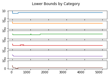
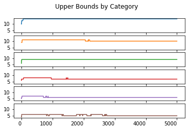
Upper and Lower Percentiles
This shows only that the required percentiles are 95% likely to fall into the calculated interval. It does not mean that these percentiles will always fall into this interval.
lower_boundary_statistics = pd.DataFrame(index = defect_types)
upper_boundary_statistics = pd.DataFrame(index = defect_types)
for i in range(1, num_trials):
sorted_observations = np.sort(sorted_categories.head(i), axis = 0)
R_lower = max(0, round(i * lower_quartile - Z * math.sqrt(i * lower_quartile * (1 - lower_quartile))) - 1)
R_upper = min(i - 1, round(i * upper_quartile + Z * math.sqrt(i * upper_quartile * (1 - upper_quartile))) - 1)
lower_boundary_statistics[i] = sorted_observations[R_lower, :]
upper_boundary_statistics[i] = sorted_observations[R_upper, :]
lower_boundary_statistics.T.plot(kind = 'line', subplots = True, sharex = True, sharey = True,
legend = False, title = 'Lower Bounds by Category', rot = 0)
upper_boundary_statistics.T.plot(kind = 'line', subplots = True, sharex = True, sharey = True,
legend = False, title = 'Upper Bounds by Category', rot = 0)
R_lower = max(0,
round(num_trials * lower_quartile - Z * math.sqrt(num_trials * lower_quartile * (1 - lower_quartile))) - 1)
R_upper = min(num_trials - 1,
round(num_trials * upper_quartile + Z * math.sqrt(num_trials * upper_quartile * (1 - upper_quartile))) - 1)
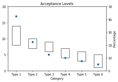
acceptance_levels = pd.DataFrame.from_dict({ 'data': [ 17, 9, 5, 4, 3, 2 ],
'lower': list(sorted_observations[R_lower,:]),
'upper': list(sorted_observations[R_upper,:]-sorted_observations[R_lower,:]) }, orient = 'index',
)
acceptance_levels.columns = defect_types
plt.show()
Acceptance Interval by Category
blank=acceptance_levels.T['lower'].fillna(0)
total = (acceptance_levels.T['data'].max() // 5 + 1) * 5

ax1 = acceptance_levels.T[['upper']].plot(ylim = (0, total), rot = 0, kind='bar',
          stacked=True, bottom=blank, legend=None, title="Acceptance Levels", fill = False, yticks = [ x for x in range(0, total + 1, 5)])
ax1.set_xlabel('Category')

ax2 = ax1.twinx()
acceptance_levels.T['data'].plot(ylim = (0, total), rot = 0, kind='line', linestyle = 'None', marker = 'o', stacked=True, legend=None, ax = ax2, yticks=[])
ax3 = ax1.twinx()
ax3.set_yticks([ x for x in range (0, 51, 10) ], [ (x * total) / 100 for x in range(0, 51, 10) ])
ax3.set_ylabel('Percentage')

plt.show()