August 17, 2020
Revising the Pareto Chart
—A look at the statistics underlying the Pareto Chart and how to improve it.
In Data Measurement and Analysis for Software Engineers, I go through Part 4 of a talk by Dennis J. Frailey. Part 4 covers statistical techniques for data analysis that are well suited for software. A number of references provided in Dennis’ talks are valuable for understanding measurement: A Look at Scales of Measurement explores the use of ordinal scales of defect severity. Part 4 makes reference to Revising the Pareto Chart, a paper by Leland Wilkinson. Wilkinson’s revision includes introducing acceptance intervals to address his concerns with the Pareto Chart.
The Pareto Chart
Joseph Juran proposed the Pareto Chart on the left and then updated it to the diagram on the right.
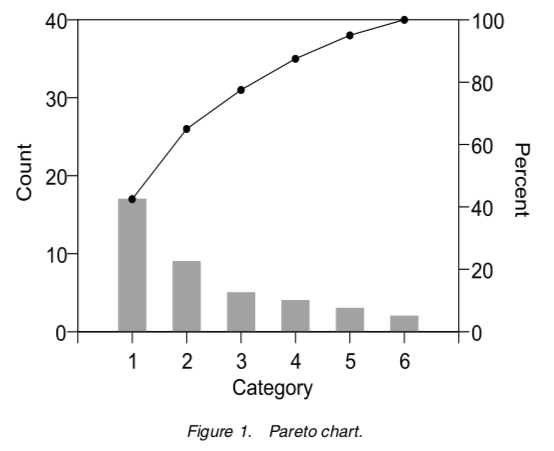
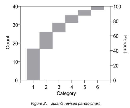
Both versions are in Juran’s Quality Handbook. Both charts are from Wilkinson’s paper. Neither chart includes acceptance intervals but the one on the right eliminates dual scales plots and better conveys intent.
Improving the Pareto Chart
Wilkinson proposes improving the Pareto chart by introducing acceptance intervals. An acceptance interval is derived from the assumption that all categories are equally probable before sorting the data by frequency. This interval is generated using the Monte Carlo Method.
The creation of a Pareto Chart involves sorting of unordered categorical data. A comparison to sorted but equally probably occurrences of unordered categorical data provides a way to identify outliers. This comparision is designed to challenge the notion that the most frequently occurring issue is the one to address. This is important when the costs of remedies are not uniform.
Wilkinson wanted to acheive two goals in revising the Pareto chart.
- To point out there is no point in attacking the vital few failures unless the data fits a Pareto or similar power distribution.
- To improve the Pareto chart so that acceptance intervals could be incorporated.
Wilkinson provides a way to compare the data distribution of the Pareto against a random distribution to identify when the data does not fits a Pareto distribution. The lack of fit provides motivation to dig a little deeper into the data and hopefully improve decision making.
What follows is an exploration of Wilkinson’s approach, including a Jupyter Notebook that I believe faithfully reproduces Wilkinson’s experiments.
Reproducing the Results
Wilkinson’s thesis challenges the wisdom of attacking Category 1 if frequencies are random and costs are not uniform. It seeks to remedy this by introducing acceptance intervals derived from assuming that all categories are equally probable before sorting.
From the paper:
Recall that the motivation for the Pareto chart was Juran’s interpretation of Pareto’s rule, that a small percent of defect types causes most defects. To identify this situation, Juran sorted the Pareto chart by frequency. Post-hoc sorting of unordered categories by frequency induces a downward trend on random data, however, so care is needed in interpreting heights of bars.
Wilkinson provides a recipe for reproducing his results. His results provide an opportunity to explore how to employ different statistics to generate acceptance intervals. What follows is how I reproduced these results.
-
Use a multinomial distribution with \(n = 40\) and \(\mbox{p-values} = \{ 1/6, 1/6, 1/6, 1/6, 1/6, 1/6 \}\) for each category. The identical p-value ensure all categories are equally probable.
In this case, the multinomial is a random variable \(X\), such that \(X = x_{i}, \forall i, 1 \ge i \le 6\).
-
For \(N = 40000\) trials, generate a multinomial \(X_{i}, \forall i, 1 \ge i \le N\) and sort each trial from the highest to lowest value. This ensures the Pareto ordering is imposed upon the random data generated during each trial.
In my experiment, the order statistics changed up to the \(30000^{th}\) to \(35000^{th}\) trial. My experiments were with 20,000 and 40,000 trials. The charts below capture the results of 40,000 trials.
-
Order each trial from smallest to largest. This simulates a Pareto distribution using random data.
-
Calculate the lower \(1 - \frac{\alpha}{2}\) and upper \(\frac{\alpha}{2}\) frequencies, where \(\alpha = 0.05\) and \(Z = 1.96\).
A non-parametric way of generating these frequencies uses the formula \(Y = N \pm Z \times \sqrt{N \times p \times (1 - p)}\), where \(p = \frac{\alpha}{2}\). In this case, Y is the position of the \(Y^{th}\) value in the ordered trials created in the previous step.
Importantly, this step identifies the \(95^{th}\) percentile using a \(95\%\) confidence interval. This is not a prediction interval for future events. It shows only where the \(95^{th}\) percentile is likely to lie.
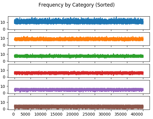
(Category 1 is the top subplot.) The interesting artifact in the frequency by category chart is the banding introduced by sorting the multinomial in each trial. This sorting applies the Pareto method to random data.
By comparison, the unsorted distribution:
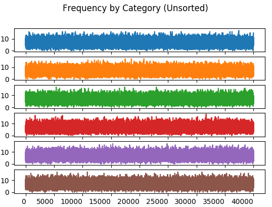
The unsorted distribution has bands that are of equal range for every category. The sorted distribution has the effect of limiting bands in each category to a much narrower range.
Order statistics include minimum and maximum frequency along with range and median. It’s unclear whether these statistics were used to ensure the Monte Carlo simulation stablized. It’s possible that only the upper and lower frequencies were used.
These charts compute their statistic for the \(n^{th}\) trial of each category. This computation includes all trials from \(1\) through \(n, n \le N\). Similarly, the \(n + 1^{st}\) trial includes all trials from \(1\) through \(n + 1\).
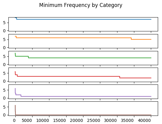
The minimum value of all trials up to and including the \(n^{th}\) trial.
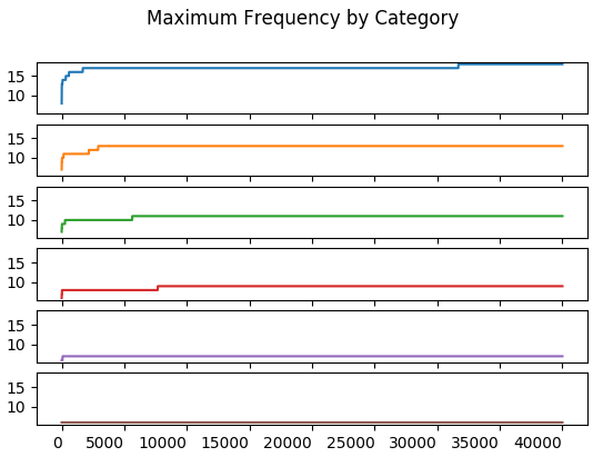
The maximum value of all trials up to and including the \(n^{th}\) trial.
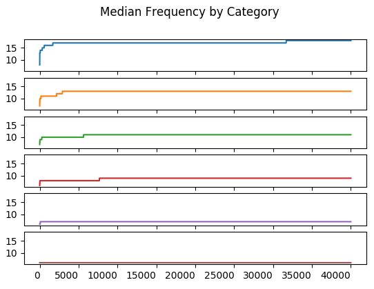
The median of all trials up to and including the \(n^{th}\) trial. It is \(Y_{\frac{n + 1}{2}}\) if \(n\) is odd; \(\frac{1}{2}(Y_{\frac{n}{2}} + Y_{\frac{n + 1}{2}})\) otherwise.
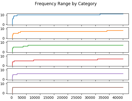
The range is \(max - min\) of all trials up to and including the \(n^{th}\) trial.
The objective of the study was to stablize the upper and lower frequencies. These frequencies match those in the original paper, implying this method has successfully reproduced the one used in the paper.
The paper says only a “few thousand” Monte Carlo simulations are required to compute the frequency bounds. Indeed, these frequencies stablize at less than 5,000 trials for most of the Monte Carlo runs. An exception exists for Category 3’s lower bound which changes between the \(17500^{th}\) and \(30000^{th}\) trial.
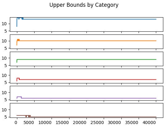
The upper frequency bound stablizes before \(5000\) trials.
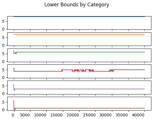
The stabilization of the upper and lower bounds happens just after the \(30000^{th}\) trial. This may be what Wilkinson refers to when he says the statisitc stabilizes in a few thousand trials. I don’t have a better explanation for the explanation of a “few thousand trials”.
In all, the use of so many order statistics may not be necessary as the results imply that the frequency bounds are the focus. An interesting question is whether the use of the non-parametric statistics for these bounds is appropriate.
Non-Parametric Statistics
Is the non-parametric approach for calculating bounds meaningful? The formula used above works well if the frequency of each trial for each category has a normal distribution. To see this I plotted a histogram for each category.
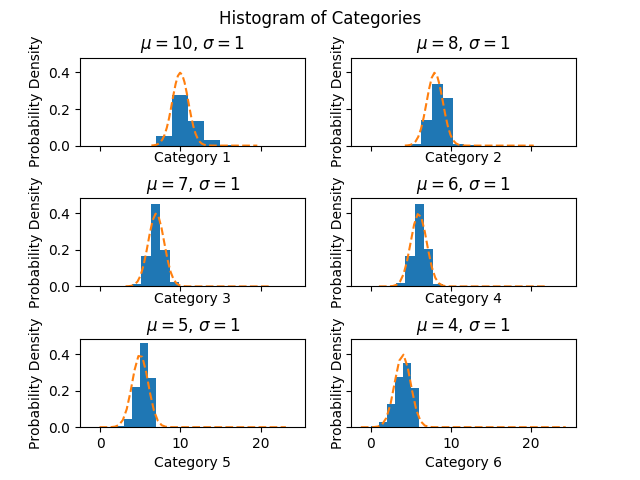
These distributions look good. Some of the misalignment of the normal is due to rounding.
Acceptance Levels
What do the acceptance levels look like for these results in comparision to those Wilkinson achieved?
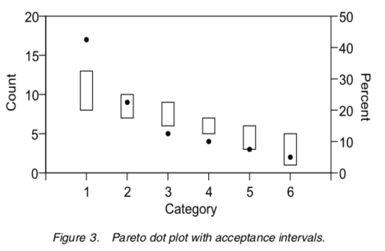
The original acceptance intervals from the paper, with 40 defects allocated to 6 categories.
The experimental version below.
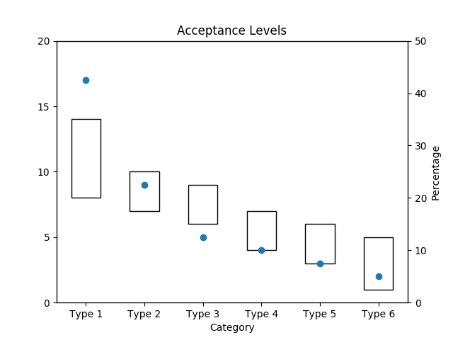
Looks like a good reproduction of the original paper.
References
Some excellent explanations of the Monte Carlo method.
- Chris Stucchio’s Modelling a Basic Income with Python and Monte Carlo Simulation
- Zachariah W Miller’s What is a Monte Carlo Simulation
A look at confidence intervals from percentials:
- C. J. Schwarz’s Sampling, Regression, Experimental Design and Analysis for Environmental Scientists, Biologists, and Resource Managers
