December 11, 2020

Creating Better Designs

  —Another look at better designs.

In What is Good Design?, I explore what Christopher Alexander says about good design and what Robert C. Martin says are traits of bad design. Here I look at what Kent Beck has to say about Responsive Design.

Post includes an attempt to rationalize what Alexander, Brooks and Beck say on design. It’s a bit of a mess, but there are good references.

Kent says that good design permits a steady introduction of new features, it’s easy to test and tune for performance. The notion of good and bad design is symmetrical. Both reflect an aesthetic sense (you know it when you see it).

Kent has a talk on Responsive Design. The start of this talk goes into the approach he used when writing the book Smalltalk Best Practice Patterns.

Used a stack of index cards to track design decisions. This included constraints, decision points, etc. to create a powerful reflective tool. This approach showed that he only had four strategies for design.

Kent called this approach Responsive Design. Design gets interesting when you have feedback: how do you design with constraints. The responsive component plays into the feedback–am I going to take the current understanding of the design or am I going to respond to the feedback.

The goal of development is the creation of a steady flow of features. You need to balance the design–not too early and not too late. You need to take careful note of what and when to design. Design principles using the PermaCulture idea: benefically relating elements.

Kent Beck’s values in design:

  • simplicity (removing extraneous elements)
  • feedback (creating closed loops on the design)
  • community (being accessible to the user community)

Patterns are important for implementation and communication. It’s not just design patterns, but smaller patterns.

Principles provide assistance when encountering a novel situation. A paper on “dynamo”–Amazon’s key-value pair storage–has a great description of their principles. Principles rapidly shrink the design space–look for the universal principles. How do you choose these principles?

These strategies are:

  • Manage your leaps–move from the current design to the new design. Move your design in safe steps; not big steps.
  • Manage large leaps in parallel–operate two designs in parallel for a while helps minimize the size of a leap. This ensures that the system is always working and permits one to see progress.
  • Stepping stone–when you can’t get to where you want to go in a safe step. Use something to take you through intermediate steps.
  • Simplification–what is the least you can do to move forward? Try to eliminate things that are not germaine in the near term but balance against long term need to change.
  • Refactor–refactor of code is important.
  • Succession–there are successive patterns that are important to follow. See the paper by Kent Beck “First One, Than Many”. (Isn’t available on-line.)
  • Data–get data on your system and try to understand what it means.

Rationale design process:

Our illusion of control over software design is a dangerous conceit best abandoned.

Brooks in Design of Design and Alexander walk through the failure of a rationale design process. Brooks focuses on the need for iteration and feedback. Alexander focuses on the combinatorial explosion of options arising from even the simplest design tasks.

See Martin Fowler’s book on refactoring:

  • refactoring in the small, easy.
  • Refactoring in the large tends to be harder.
  • Most of the hard problems in programming turn out to be design problems.

See Alexander:

No single best design:

But design has a dark side. While there isn’t a single best design for any system, there are many poor designs for that same system.

Design for feedback:

Over-designing early leads to delaying feedback from real usage of the system, makes adding features more complicated, and makes adapting the design more difficult. By the same token, under-designing makes adding features more complicated, increases defects, and makes adapting the design more difficult.

You read somewhere that “fit” in design, according to Alexander doesn’t work in software. I think that’s the wrong way to look at it. Fit is about appropriateness to form and context. Fit in software includes form and context.

Consider the Singleton pattern. There are good examples on when to employ this pattern and when not to. If you employ the pattern you better be aware of the double-checked lock pattern if the singleton is used with multiple threads. If you employ the pattern in a single-threaded environment then you don’t need the lock.
November 12, 2020

The Daily Stand Up (Chickens Have Taken Over)

  —When I watch the team interact during stand up I'm dismayed by what I see. It's like I'm looking at two different groups of people. In reality, it's the same people in different situations.

The software team and I have been struggling with how to improve our stand up. One challenge was improving communication. This challenge involves creating an environment where the team is not stiffled by outsiders.

When I watch the team interact I’m happy with what I see. I see a team that’s engaged in achieving its objectives and heavily embracing collaboration. When I watch the team interact during stand up I’m dismayed by what I see. It’s like I’m looking at two different groups of people. In reality, it’s the same people in different situations. One appears comfortable. The other not so much.

My team hates their stand up. As their manager, it’s painful to watch. As I watch, I am reminded of awful circumstances.

I’ve long acknowledged that the outside presence is too heavy for this team. It smothers and stiffles them. The best characterization I can give is that the team is a collection of gentle souls. The heaviness comes from the weight of opinion and direction from outside the team. For some reason, the team collapses in the face of this onslaught. For me, it’s a failure of the Manager and the Scrum Master.

My challenge as the manager is to inject a change into the stand up that achieves two goals.

  • Doesn’t censor people.
  • Provides the team with breathing space.

We’ve played with the notion of asking for huddles up front. That didn’t work because the team didn’t execute. This makes the situation complicated, because it implies that

  • they don’t need the huddles.
  • they don’t understand how to use the huddles.

The solution to address the challenges and to flesh out the huddle is to force the huddle. The idea is to use the huddle to provide the team a way to extract themselves to make a decision without outside influence. Basically, I’m going to trust my instincts and whenever I percieve the team being pushed around I will tell, not ask, for a huddle and assign someone to communicate the decision.

It’s the best that I can do. It’s also the smallest change I can make to enable better outcomes.

October 14, 2020

Application Logging

  —A look at how to deliver reliable software.

I was looking for a simple, pragmatic example on how to inject logging into an application and came across this solution. Game Programming Patterns provides a collection of design patterns for, well, game programming. I’m not a game programmer, but I found the writing style engaging and the the information pragmatic.

On the writting style:

But the architecture this brilliant code hung from was often an afterthought. They were so focused on features that organization went overlooked. Coupling was rife between modules. New features were often bolted onto the codebase wherever they could be made to fit. To my disillusioned eyes, it looked like many programmers, if they ever cracked open Design Patterns at all, never got past Singleton.

My God! I’ve lived through this. This experience reflects my own in Relearning Design Patterns.

It goes on to describe how this brilliant code base contained gems that were difficult to unearth because the programmers creating the work had obscured things. They obscured things because of schedule pressure. This sentiment here reflects “Awful Code. Awful Circumstances.”.

Then there is the Service Locator pattern:

Provide a global point of access to a service without coupling users to the concrete class that implements it.

And there it was. A nice pattern for logging.

Serivce Locator references:

Logging best practice:

September 15, 2020

Another Look at Revising the Pareto Chart

  —The Python code behind the Revising the Pareto Chart

This Juypter notebook reproduces the experiment in Revising the Pareto Chart. It includes the source code for all of the graphs in that article and the Monte Carlo algorithm used.

It’s important to note that what appears here and in Revising the Pareto Chart may not accurately reproduce the experiments described in Wilkinson’s original paper.

What appears in my articles are my attempt to reproduce Wilkinson’s work. Deviations between Wilkinson’s results and my own are noted.

Defect Types

There are 6 defect types. The nature of these defects is irrelevant. It is sufficient that the categories be identified.

defect_types = [ 'Type 1', 'Type 2', 'Type 3', 'Type 4', 'Type 5', 'Type 6', ]
num_defect_types = len(defect_types)

Number of Defects

There are $40$ defects. This is a randomly chosen number.

num_defects = 40

Probability Distribution

The probability distribution for defects assumes a multinomial with equal p-values.

Defect Type P-Values

A critical part of the thesis requires that each defect type occur with equal probability. These p-values enforce this constraint.

equal_p_values = [ 1 / num_defect_types ] * num_defect_types

Multimomial Probability Mass Function

A multinomial distribution is selected because we want each trial to result in a random distribution of the number of observed defects in a trial.

from scipy.stats import *
defect_distribution_per_trial = multinomial(num_defects, equal_p_values)

Monte Carlo Algorithm

The number of trials is key to reproducing the experiment. You get different results for $5000$, $20000$ and $40000$ trials.

An open question regarding the original paper and these experiments is what does “a few thousand trials” mean. I suspect that the original paper used closer to 5,000 trials. These experiments and the results in my artical show that the order statistics change through the $30000$ to $350000$ trials.

num_trials = 5000

Sample Generation

For each sample, randomly assign the defects to each category.

def generate_sample():
    """Obtain a single sample."""
    return defect_distribution_per_trial.rvs()[0]

Two collections of trials are retained. Sorted trials mimics the algorithm in the paper. Trials takes a look at what happens if the results are not sorted according to the Pareto method.

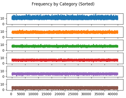
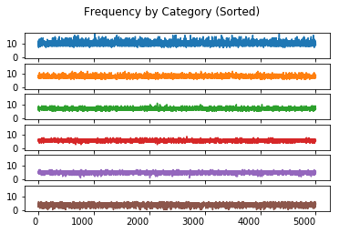
The value of sorted and unsorted trials lies in observing the banding that occurs in the sorted trials. This banding reflects the Pareto distribution and is critical to reproducing the experiement.

import math
import numpy as np
import pandas as pd
trial = list()
sorted_trial = list()
for k in range(num_trials):
    s = generate_sample()
    trial.append(s)
    sorted_trial.append(np.sort(s)[::-1])

The Data Plots

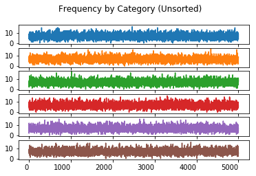
Frequency By Category (Unsorted)

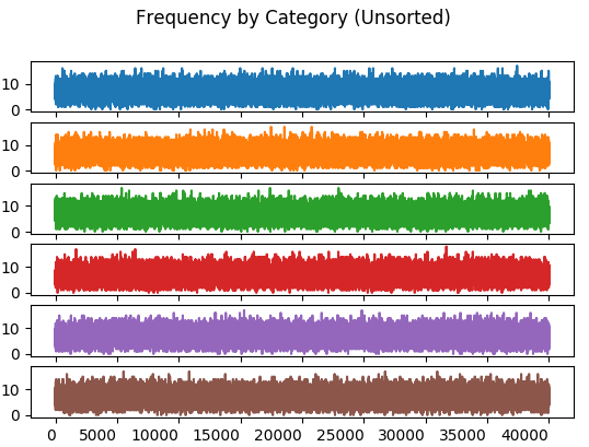
The value of charting the unsorted frequency lies in ensuring that the sorting the trails reproduces the Pareto distribution required by the experiement.

import matplotlib.pyplot as plt
categories = pd.DataFrame(trial, columns = defect_types)
categories.plot(kind = 'line', subplots = True, sharex = True, sharey = True,
    legend = False, title = 'Frequency by Category (Unsorted)', rot = 0)
array([<matplotlib.axes._subplots.AxesSubplot object at 0x11b4721d0>,
       <matplotlib.axes._subplots.AxesSubplot object at 0x11bf13c50>,
       <matplotlib.axes._subplots.AxesSubplot object at 0x11bed4eb8>,
       <matplotlib.axes._subplots.AxesSubplot object at 0x11bf561d0>,
       <matplotlib.axes._subplots.AxesSubplot object at 0x11bf824a8>,
       <matplotlib.axes._subplots.AxesSubplot object at 0x11be6c780>],
      dtype=object)
Frequency By Category (Unsorted)

Frequency By Category (Sorted)

The value of charting the sorted frequency is the insight it provides on the effect of sorting the data in each trial.

sorted_categories = pd.DataFrame(sorted_trial, columns = defect_types)
sorted_categories.plot(kind = 'line', subplots = True, sharex = True, sharey = True,
    legend = False, title = 'Frequency by Category (Sorted)', rot = 0)
array([<matplotlib.axes._subplots.AxesSubplot object at 0x11be6c9e8>,
       <matplotlib.axes._subplots.AxesSubplot object at 0x11baec908>,
       <matplotlib.axes._subplots.AxesSubplot object at 0x11b8fa630>,
       <matplotlib.axes._subplots.AxesSubplot object at 0x11b9f47f0>,
       <matplotlib.axes._subplots.AxesSubplot object at 0x11b90c748>,
       <matplotlib.axes._subplots.AxesSubplot object at 0x11b94b4a8>],
      dtype=object)
Frequency By Category (Sorted)

Order Statistics

Wilkinson describes the requirement for order statistics to stablize. The paper doesn’t describe the use of any order statistics, except upper and lower frequency bounds. I explore several different order statitics in this section.

minimum_statistic = pd.DataFrame(columns = defect_types)
maximum_statistic = pd.DataFrame(columns = defect_types)
median_statistic = pd.DataFrame(columns = defect_types)
range_statistic = pd.DataFrame(columns = defect_types)
for i in range(0, num_trials):
    minimum_statistic.loc[i] = sorted_categories.head(i).min()
    maximum_statistic.loc[i] = sorted_categories.head(i).max()
    median_statistic.loc[i] = sorted_categories.head(i).max()
    range_statistic.loc[i] = (sorted_categories.head(i).max() - sorted_categories.head(i).min())

Minimum Order Statistic

minimum_statistic.plot(kind = 'line', subplots = True, sharex = True, sharey = True,
    legend = False, title = 'Minimum Frequency by Category', rot = 0)
array([<matplotlib.axes._subplots.AxesSubplot object at 0x11b8fbc18>,
       <matplotlib.axes._subplots.AxesSubplot object at 0x11b56add8>,
       <matplotlib.axes._subplots.AxesSubplot object at 0x11b8c16a0>,
       <matplotlib.axes._subplots.AxesSubplot object at 0x11b6a9668>,
       <matplotlib.axes._subplots.AxesSubplot object at 0x11b75c630>,
       <matplotlib.axes._subplots.AxesSubplot object at 0x11b8015f8>],
      dtype=object)
Minimum Order Statistic

Maximum Order Statistic

maximum_statistic.plot(kind = 'line', subplots = True, sharex = True, sharey = True,
    legend = False, title = 'Maximum Frequency by Category', rot = 0)
array([<matplotlib.axes._subplots.AxesSubplot object at 0x11b7e4cc0>,
       <matplotlib.axes._subplots.AxesSubplot object at 0x11b6ec828>,
       <matplotlib.axes._subplots.AxesSubplot object at 0x116bc9a58>,
       <matplotlib.axes._subplots.AxesSubplot object at 0x116bf1d30>,
       <matplotlib.axes._subplots.AxesSubplot object at 0x11ac9f048>,
       <matplotlib.axes._subplots.AxesSubplot object at 0x11b56f320>],
      dtype=object)
Maximum Order Statistic

Median Order Statistic

median_statistic.plot(kind = 'line', subplots = True, sharex = True, sharey = True,
    legend = False, title = 'Median Frequency by Category', rot = 0)
array([<matplotlib.axes._subplots.AxesSubplot object at 0x11b8fd5c0>,
       <matplotlib.axes._subplots.AxesSubplot object at 0x11c340278>,
       <matplotlib.axes._subplots.AxesSubplot object at 0x11c365518>,
       <matplotlib.axes._subplots.AxesSubplot object at 0x11c38d7f0>,
       <matplotlib.axes._subplots.AxesSubplot object at 0x11c3b4ac8>,
       <matplotlib.axes._subplots.AxesSubplot object at 0x11c3dcda0>],
      dtype=object)
Median Order Statistic

Range Order Statistic

range_statistic.plot(kind = 'line', subplots = True, sharex = True, sharey = True,
    legend = False, title = 'Frequency Range by Category', rot = 0)
array([<matplotlib.axes._subplots.AxesSubplot object at 0x11c5357b8>,
       <matplotlib.axes._subplots.AxesSubplot object at 0x11c57b8d0>,
       <matplotlib.axes._subplots.AxesSubplot object at 0x11c5a1ba8>,
       <matplotlib.axes._subplots.AxesSubplot object at 0x11c5c9e80>,
       <matplotlib.axes._subplots.AxesSubplot object at 0x11c5fb198>,
       <matplotlib.axes._subplots.AxesSubplot object at 0x11c624470>],
      dtype=object)
Range Order Statistic

Histogram by Category

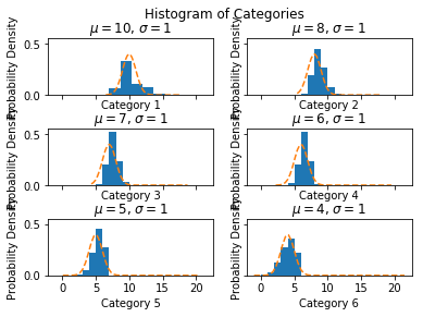
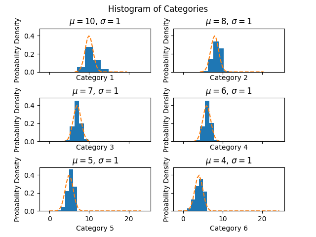
The value of charting a histogram by category is that it shows the distribution of the sorted data and permits the exploration of whether this sorting matches a normal distribution.

Determination of whether this is a normal distribution is important to understanding if the calculation of the confidence intervals for a percentile should use the normal distribution’s $Z$ value.

num_bins = num_defect_types
fig, ax = plt.subplots(nrows = 3, ncols = 2, sharex = True, sharey = True)
fig.suptitle('Histogram of Categories')
fig.subplots_adjust(hspace=0.6)
for i in range(0, num_defect_types):
    mu = round(sorted_categories.T.iloc[i].mean())
    std = round(sorted_categories.T.iloc[i].std())
    col = i % 2
    row = i // 2
    n, bins, patches = ax[row, col].hist(sorted_categories.T.iloc[i], num_bins, density=1)
    xmin, xmax = plt.xlim()
    y = np.linspace(xmin, xmax, (num_bins + 1)**2) # Selected points to create rounded curve.
    p = norm.pdf(y, mu, std)
    ax[row , col].plot(y, p, '--')
    ax[row , col].set_xlabel('Category {}'.format(i + 1))
    ax[row , col].set_title('$\mu={:10.0f}$, $\sigma={:10.0f}$'.format(mu, std))
    ax[row , col].set_ylabel('Probability Density')
Histogram by Category

Confidence Interval for a Percentile

I chose to interpret the $\alpha = 0.05$ and the calculation of the frequency bounds $\frac{1}{\alpha}$ and $1 - \frac{1}{\alpha}$ using the confidence interval for a percentile. Both frequency bounds are calculated using the high and low percentiles derived from this $\alpha$.

Z = 1.96
alpha = 0.05
half_alpha = alpha / 2
lower_quartile = half_alpha
upper_quartile = 1 - half_alpha

Upper and Lower Percentiles

This shows only that the required percentiles are 95% likely to fall into the calculated interval. It does not mean that these percentiles will always fall into this interval.

lower_boundary_statistics = pd.DataFrame(index = defect_types)
upper_boundary_statistics = pd.DataFrame(index = defect_types)
for i in range(1, num_trials):
    sorted_observations = np.sort(sorted_categories.head(i), axis = 0)
    R_lower = max(0, round(i * lower_quartile - Z * math.sqrt(i * lower_quartile * (1 - lower_quartile))) - 1)
    R_upper = min(i - 1, round(i * upper_quartile + Z * math.sqrt(i * upper_quartile * (1 - upper_quartile))) - 1)
    lower_boundary_statistics[i] = sorted_observations[R_lower, :]
    upper_boundary_statistics[i] = sorted_observations[R_upper, :]

lower_boundary_statistics.T.plot(kind = 'line', subplots = True, sharex = True, sharey = True,
    legend = False, title = 'Lower Bounds by Category', rot = 0)
upper_boundary_statistics.T.plot(kind = 'line', subplots = True, sharex = True, sharey = True,
    legend = False, title = 'Upper Bounds by Category', rot = 0)


R_lower = max(0, 
            round(num_trials * lower_quartile - Z * math.sqrt(num_trials * lower_quartile * (1 - lower_quartile))) - 1)
R_upper = min(num_trials - 1, 
            round(num_trials * upper_quartile + Z * math.sqrt(num_trials * upper_quartile * (1 - upper_quartile))) - 1)
acceptance_levels = pd.DataFrame.from_dict({ 'data': [ 17, 9, 5, 4, 3, 2 ],
    'lower': list(sorted_observations[R_lower,:]), 
    'upper': list(sorted_observations[R_upper,:]-sorted_observations[R_lower,:]) }, orient = 'index',
)
acceptance_levels.columns = defect_types
plt.show()
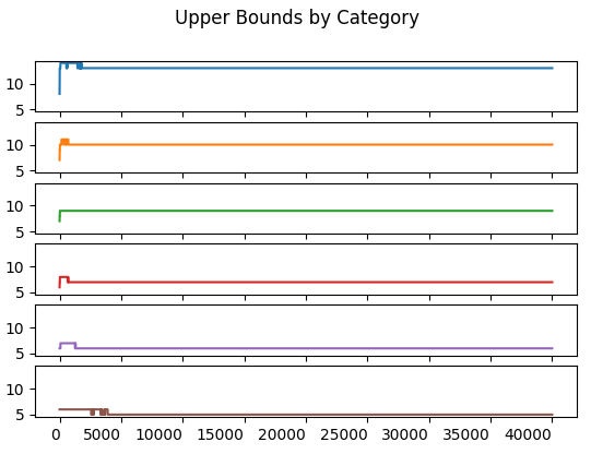
Upper Frequency by Category
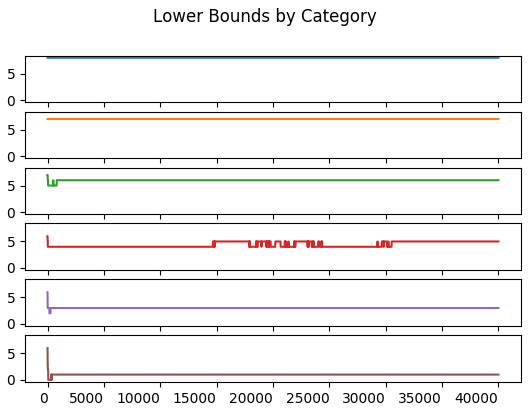
Lower Frequency by Category

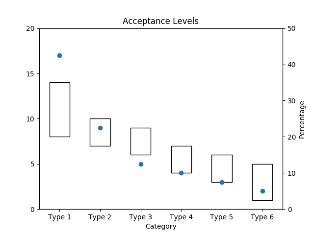
Acceptance Interval by Category

blank=acceptance_levels.T['lower'].fillna(0)
total = (acceptance_levels.T['data'].max() // 5 + 1) * 5

ax1 = acceptance_levels.T[['upper']].plot(ylim = (0, total), rot = 0, kind='bar',
          stacked=True, bottom=blank, legend=None, title="Acceptance Levels", fill = False, yticks = [ x for x in range(0, total + 1, 5)])
ax1.set_xlabel('Category')

ax2 = ax1.twinx()
acceptance_levels.T['data'].plot(ylim = (0, total), rot = 0, kind='line', linestyle = 'None', marker = 'o', stacked=True, legend=None, ax = ax2, yticks=[])
ax3 = ax1.twinx()
ax3.set_yticks([ x for x in range (0, 51, 10) ], [ (x * total) / 100 for x in range(0, 51, 10) ])
ax3.set_ylabel('Percentage')

plt.show()
Acceptance Interval by Category

August 17, 2020

Revising the Pareto Chart

  —A look at the statistics underlying the Pareto Chart and how to improve it.

In Data Measurement and Analysis for Software Engineers, I go through Part 4 of a talk by Dennis J. Frailey. Part 4 covers statistical techniques for data analysis that are well suited for software. A number of references provided in Dennis’ talks are valuable for understanding measurement: A Look at Scales of Measurement explores the use of ordinal scales of defect severity. Part 4 makes reference to Revising the Pareto Chart, a paper by Leland Wilkinson. Wilkinson’s revision includes introducing acceptance intervals to address his concerns with the Pareto Chart.

The Pareto Chart

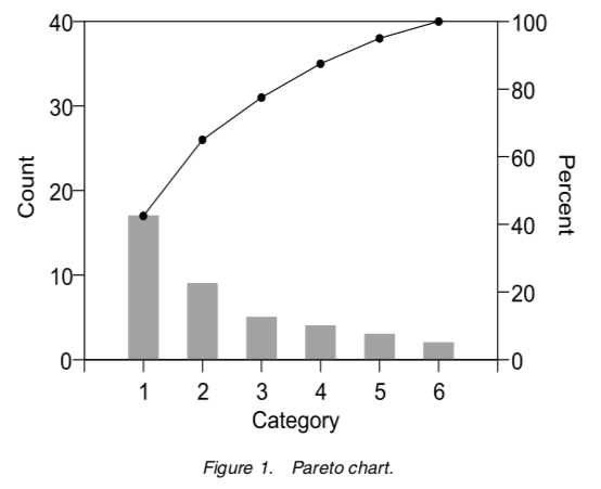
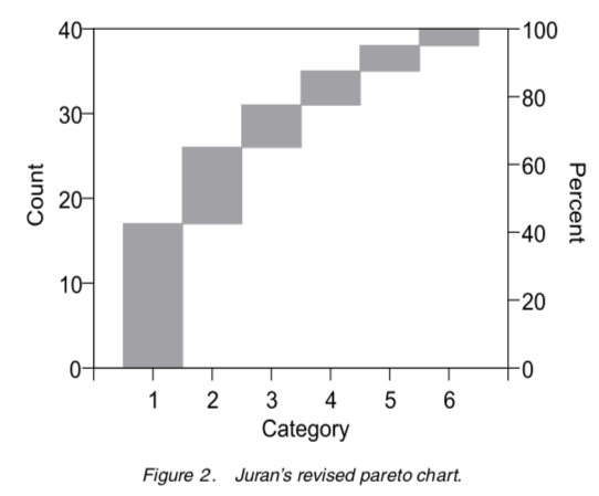
Joseph Juran proposed the Pareto Chart on the left and then updated it to the diagram on the right.

Both versions are in Juran’s Quality Handbook. Both charts are from Wilkinson’s paper. Neither chart includes acceptance intervals but the one on the right eliminates dual scales plots and better conveys intent.

Improving the Pareto Chart

Wilkinson proposes improving the Pareto chart by introducing acceptance intervals. An acceptance interval is derived from the assumption that all categories are equally probable before sorting the data by frequency. This interval is generated using the Monte Carlo Method.

The creation of a Pareto Chart involves sorting of unordered categorical data. A comparison to sorted but equally probably occurrences of unordered categorical data provides a way to identify outliers. This comparision is designed to challenge the notion that the most frequently occurring issue is the one to address. This is important when the costs of remedies are not uniform.

Wilkinson wanted to acheive two goals in revising the Pareto chart.

  1. To point out there is no point in attacking the vital few failures unless the data fits a Pareto or similar power distribution.
  2. To improve the Pareto chart so that acceptance intervals could be incorporated.

Wilkinson provides a way to compare the data distribution of the Pareto against a random distribution to identify when the data does not fits a Pareto distribution. The lack of fit provides motivation to dig a little deeper into the data and hopefully improve decision making.

What follows is an exploration of Wilkinson’s approach, including a Jupyter Notebook that I believe faithfully reproduces Wilkinson’s experiments.

Reproducing the Results

Wilkinson’s thesis challenges the wisdom of attacking Category 1 if frequencies are random and costs are not uniform. It seeks to remedy this by introducing acceptance intervals derived from assuming that all categories are equally probable before sorting.

From the paper:

Recall that the motivation for the Pareto chart was Juran’s interpretation of Pareto’s rule, that a small percent of defect types causes most defects. To identify this situation, Juran sorted the Pareto chart by frequency. Post-hoc sorting of unordered categories by frequency induces a downward trend on random data, however, so care is needed in interpreting heights of bars.

Wilkinson provides a recipe for reproducing his results. His results provide an opportunity to explore how to employ different statistics to generate acceptance intervals. What follows is how I reproduced these results.

  1. Use a multinomial distribution with \(n = 40\) and \(\mbox{p-values} = \{ 1/6, 1/6, 1/6, 1/6, 1/6, 1/6 \}\) for each category. The identical p-value ensure all categories are equally probable.

    In this case, the multinomial is a random variable \(X\), such that \(X = x_{i}, \forall i, 1 \ge i \le 6\).

  2. For \(N = 40000\) trials, generate a multinomial \(X_{i}, \forall i, 1 \ge i \le N\) and sort each trial from the highest to lowest value. This ensures the Pareto ordering is imposed upon the random data generated during each trial.

    In my experiment, the order statistics changed up to the \(30000^{th}\) to \(35000^{th}\) trial. My experiments were with 20,000 and 40,000 trials. The charts below capture the results of 40,000 trials.

  3. Order each trial from smallest to largest. This simulates a Pareto distribution using random data.

  4. Calculate the lower \(1 - \frac{\alpha}{2}\) and upper \(\frac{\alpha}{2}\) frequencies, where \(\alpha = 0.05\) and \(Z = 1.96\).

    A non-parametric way of generating these frequencies uses the formula \(Y = N \pm Z \times \sqrt{N \times p \times (1 - p)}\), where \(p = \frac{\alpha}{2}\). In this case, Y is the position of the \(Y^{th}\) value in the ordered trials created in the previous step.

    Importantly, this step identifies the \(95^{th}\) percentile using a \(95\%\) confidence interval. This is not a prediction interval for future events. It shows only where the \(95^{th}\) percentile is likely to lie.

(Category 1 is the top subplot.) The interesting artifact in the frequency by category chart is the banding introduced by sorting the multinomial in each trial. This sorting applies the Pareto method to random data.

By comparison, the unsorted distribution:

The unsorted distribution has bands that are of equal range for every category. The sorted distribution has the effect of limiting bands in each category to a much narrower range.

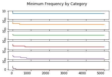
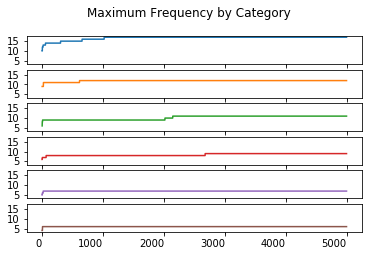
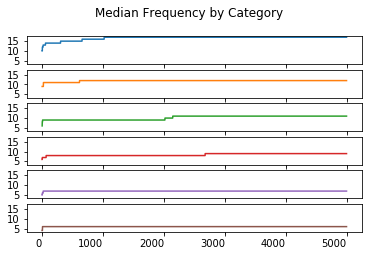
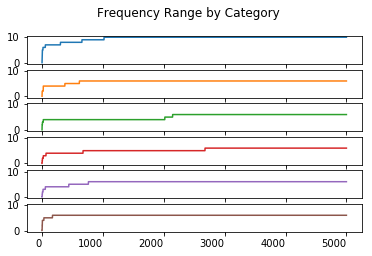
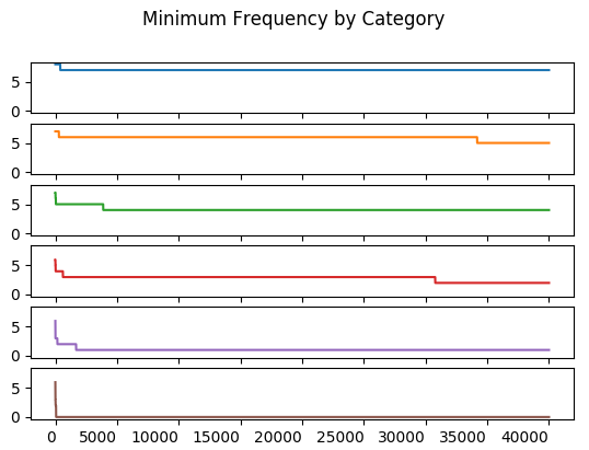
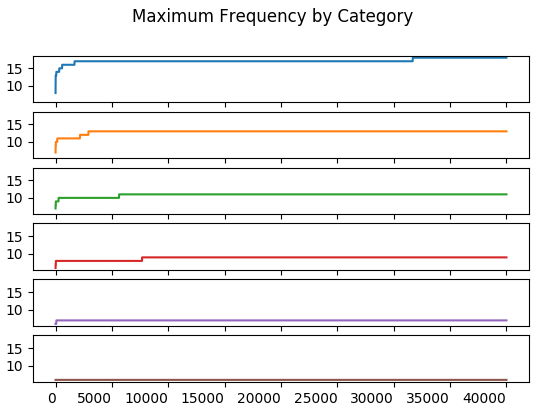
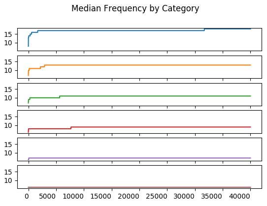
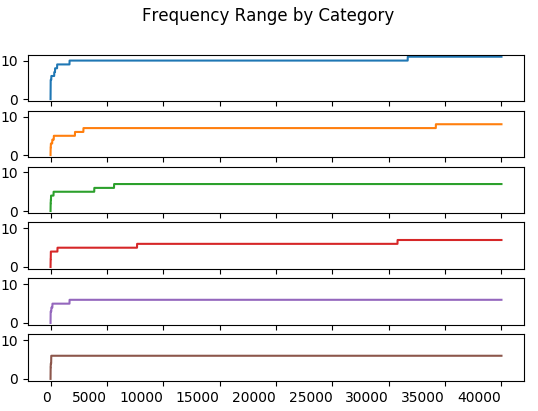
Order statistics include minimum and maximum frequency along with range and median. It’s unclear whether these statistics were used to ensure the Monte Carlo simulation stablized. It’s possible that only the upper and lower frequencies were used.

These charts compute their statistic for the \(n^{th}\) trial of each category. This computation includes all trials from \(1\) through \(n, n \le N\). Similarly, the \(n + 1^{st}\) trial includes all trials from \(1\) through \(n + 1\).

The minimum value of all trials up to and including the \(n^{th}\) trial.

The maximum value of all trials up to and including the \(n^{th}\) trial.

The median of all trials up to and including the \(n^{th}\) trial. It is \(Y_{\frac{n + 1}{2}}\) if \(n\) is odd; \(\frac{1}{2}(Y_{\frac{n}{2}} + Y_{\frac{n + 1}{2}})\) otherwise.

The range is \(max - min\) of all trials up to and including the \(n^{th}\) trial.

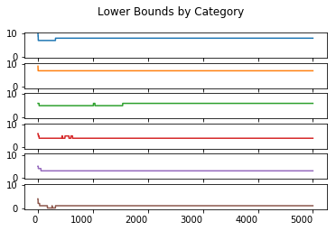
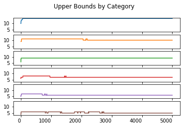
The objective of the study was to stablize the upper and lower frequencies. These frequencies match those in the original paper, implying this method has successfully reproduced the one used in the paper.

The paper says only a “few thousand” Monte Carlo simulations are required to compute the frequency bounds. Indeed, these frequencies stablize at less than 5,000 trials for most of the Monte Carlo runs. An exception exists for Category 3’s lower bound which changes between the \(17500^{th}\) and \(30000^{th}\) trial.

The upper frequency bound stablizes before \(5000\) trials.

The stabilization of the upper and lower bounds happens just after the \(30000^{th}\) trial. This may be what Wilkinson refers to when he says the statisitc stabilizes in a few thousand trials. I don’t have a better explanation for the explanation of a “few thousand trials”.

In all, the use of so many order statistics may not be necessary as the results imply that the frequency bounds are the focus. An interesting question is whether the use of the non-parametric statistics for these bounds is appropriate.

Non-Parametric Statistics

Is the non-parametric approach for calculating bounds meaningful? The formula used above works well if the frequency of each trial for each category has a normal distribution. To see this I plotted a histogram for each category.

These distributions look good. Some of the misalignment of the normal is due to rounding.

Acceptance Levels

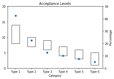
What do the acceptance levels look like for these results in comparision to those Wilkinson achieved?

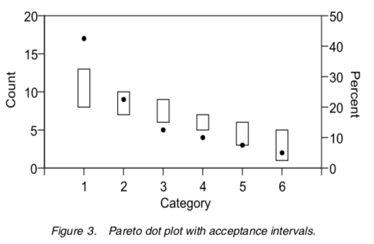
The original acceptance intervals from the paper, with 40 defects allocated to 6 categories.

The experimental version below.

Looks like a good reproduction of the original paper.

References

Some excellent explanations of the Monte Carlo method.

A look at confidence intervals from percentials: